In the Spring of 2020, like many people, I reshuffled my life and business to fit with the changing shape of living through a pandemic. Planned teaching and usual selling opportunities had slipped away and I had to find a different way to sustain my business and reach my customers, (as well as the added bonus of being a less than adequate home school teacher to our three children).
It was an interesting and sometimes challenging transition, but one that I’m thankful for, especially in light of so many livelihoods that simply don’t have the option of adapting to fit new regulations. And out of this shake-up came the opportunity to action a plan that had been waiting in the wings for the right moment. Enter stage right: The Bristol Blanket
The decision to produce the blanket with Bristol Weaving Mill wasn’t really a decision at all on my part. As I saw my handwoven designs, inspired by the Bristol houses, develop on my sampling loom and in my sketchbooks, it became obvious who I had to work with on this project. Click on the links to read more about the production journey and the inspiration in these additional blog posts.
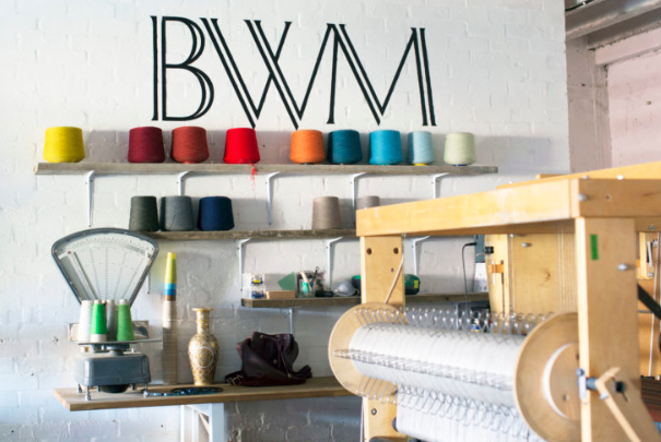
Bristol Weaving Mill.
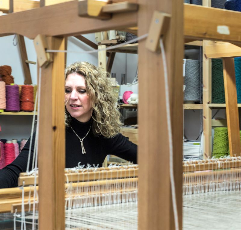
I’ve continued to weave a limited number of commissioned rugs and art panels throughout the year and was also able to weave the capsule collection, pictured below, to support the new blanket design. In the midst of so much uncertainty in the news, the sessions at the loom were refreshingly grounding and I never take for granted that half my job is to focus on the calming rhythmic process of weaving. That said, it’s been quite full-on, and seeing this project come together during the photo-shoot with the superb Article Studio was quite a momentous day after months of planning.
The Bristol Blanket Collection. Photo: Article Studio Furniture: Timberwoolf
Five feel-good things I’d like you to know about The Bristol Blanket
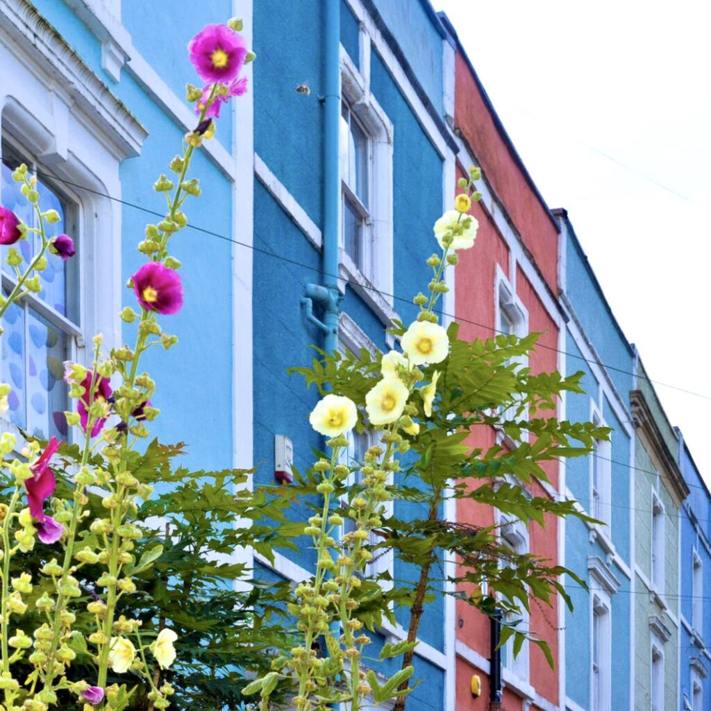
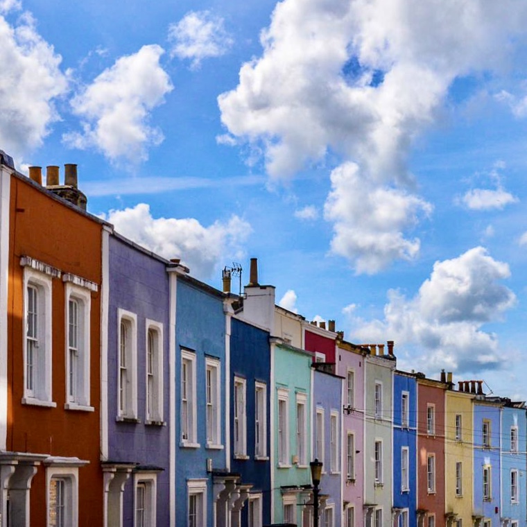
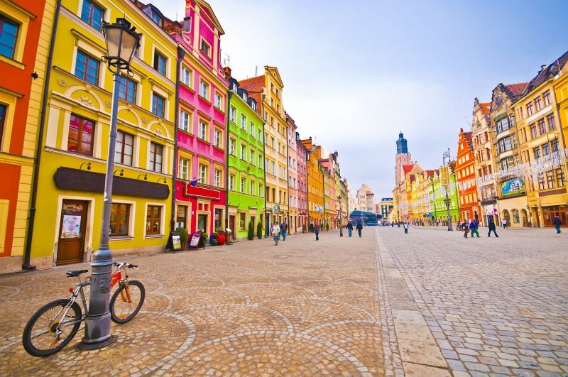
The design is inspired by Bristol’s colourful houses, which brightened up our daily walks during the lockdown in the Spring. Read more here
It is woven in partnership with Bristol Weaving Mill. A renowned micro mill in the heart of my home city of Bristol, specialising n innovative design. Read more here
The optimistic colours in this sumptuous 100% lambswool blanket are designed to lift your spirits and bring warmth and joy to your home, and it is so soft. (I provide samples for those who prefer to feel the quality of a textile product before they invest. Drop me a line if you’d like to receive one).
The design reflects the connections with our neighbours and local community which for many were strengthened during the lockdown. As an artist, I wanted to design a collection that echoed the special bonds that formed from the shared experiences, in the hope that we continue to strengthen them and support each other.
For every blanket sold, 10% of the profit will go to MIND- the mental health charity.
I’m delighted to launch The Bristol Blanket ahead of schedule and hope I can help to bring warmth and joy to more people this winter. Drop me a line if you have any questions and head over to my online shop to check out this uplifting new design from my Bristol studio.
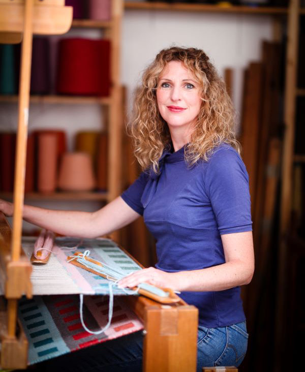
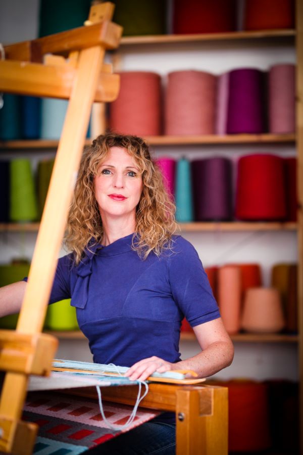
Angie Parker is a weaver, designer, and colourist, based at BV Studios in Bedminster. She trained in rug weaving in the 1990s and started her textile practice 6 years ago. Her latest collection of handwoven designs and small batch-produced textiles has been launched ahead of schedule in September 2020. Subscribers to her newsletter are the first to see new designs and also get access to special offers and exhibition news. Sign up here to keep in the loop.
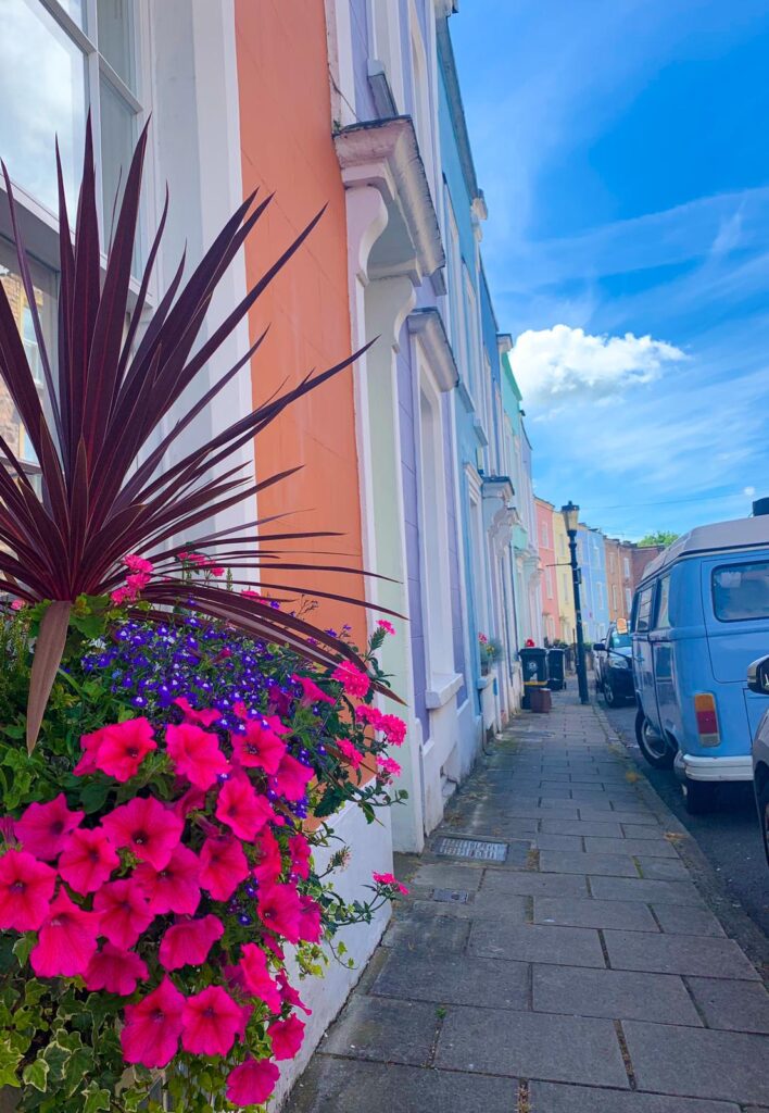
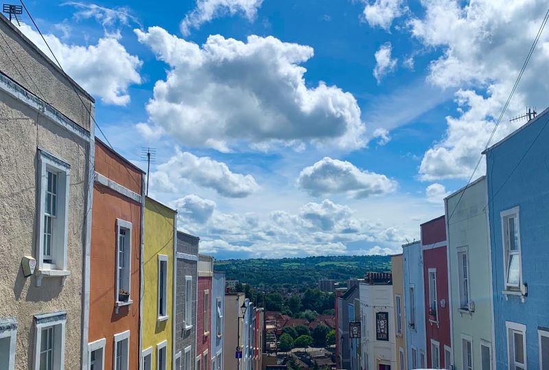
It’s not hard to understand why colour lovers enjoy living in Bristol. Is there a more colourful city anywhere else in the UK?
Since the mid-1960s, there’s been a growing number of brightly painted houses lighting up the urban landscape, something which has grown in popularity in recent years. I’m sure I’m not the only one who enjoyed a new appreciation for these uplifting views during the months of lockdown.
When the bursts of colour from our daily walks started to find their way into my handwoven designs, I decided to do some research into the history of these picturesque houses. To help with this I approached architects Stride Treglown and Jess Siggers, as I was already aware that in 2017 they launched the Bristol Colour Capital initiative, to promote Bristol as the most colourful city in the UK. They collated and presented research from residents at a seminar, where the scheme to link re-painting homes with utilising home energy improvement grants was discussed. Head of sustainability, Rob Delius, kindly shared these findings to enable me to continue the colour part of the conversation.
How did it all begin?
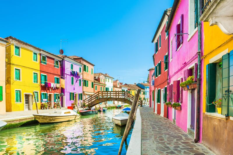
Rumour has it that George Ferguson, (architect, entrepreneur, and politician), may have been the first to paint his newly acquired home in Cliftonwood. I caught up with George recently and established that he did indeed paint his dull grey house a terracotta red in 1966, using Sandtex masonry paint. (If you know any from before this date please do let me know). His pal up the road painted his a rich blue shade at the same time, and this is how one of the most colourful and photogenic streets in the city started.
Ambrose Road, Cliftonwood. Where it all started?
It was interesting to discover from George that these terraces were previously earmarked for demolition, with the proposal of three blocks of flats to replace them. This u-turn in planning enabled savvy investors to buy the run-down properties cheaply, and it gave them the opportunity to make their mark on the city. The views of these houses from the docks are almost as photographed as the suspension bridge. George cites the influence of 1960’s psychedelia, Glastonbury, and the general feeling of freedom at the time for his, and his friend’s decision to paint the depressing grey facing on their homes. And with so many of Bristol’s terraced houses being rendered, it’s easy to see how this idea gathered momentum.
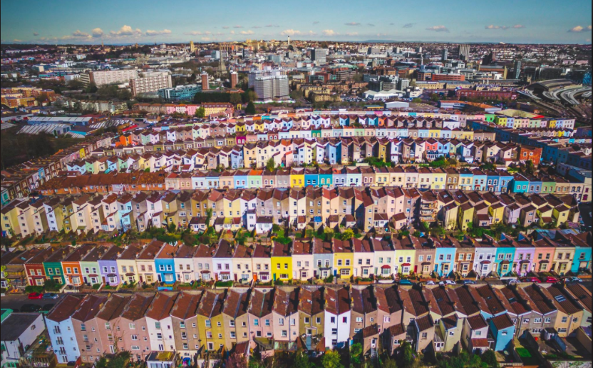
Another rumour is that this trend started in Totterdown, where a local decorator offered cheap house painting to make use of the free coloured paints he’d acquired. The stunning aerial photo by Josh Perrett (below) shows that the painters have been pretty busy since these first few daring homeowners started the ball rolling. I’d really like to know more about these houses, so if you know any other interesting stories please do drop me a line and I can update things.
Obviously, painted houses aren’t exclusive to Bristol, but the difference in this city is that the trend was led by the residents, rather than artist initiatives or planners. That said, Bristol is home to thousands of artists and creatives, so it’s hardly a surprise the residents here take every opportunity to express themselves through bold combinations of house colour and front doors. It seems that once one person takes the plunge, the rest of the street gradually follows.
Many locals agree that the hilly landscape in the city lends itself to the aesthetic, with one respondent to the Stride Treglown (ST) survey pointing out how much they love spotting their home from the opposite side of the city. Over the past decade, things have gathered pace, with reasons including a love of colour, the influence of travel, and simply wanting to join in with what many see as ‘a Bristol thing’. Colour choices are very personal, but according to ST report, most respondents were considerate of their neighbours when selecting colours that compliment the rest of their street.
I’ve yet to have a conversation with anyone who has a negative reaction to the houses, and everyone I’ve asked finds the views uplifting and cheerful. And as a designer, I feel incredibly fortunate to have such joyful and inspiring blocks of colour to feast my eyes on, every time I walk out of my house.
There is so much more that I want to find out, and I see this blog post as the start of an ongoing dialogue. Does living in a colourful neighbourhood make people happier? Can colour really improve health and well-being? Does Bristol have more coloured houses than any other UK City?
This final question led to a spin-off blog post investigating colourful neighbourhoods around the globe which you can read here.
A handwoven rug in the studio.
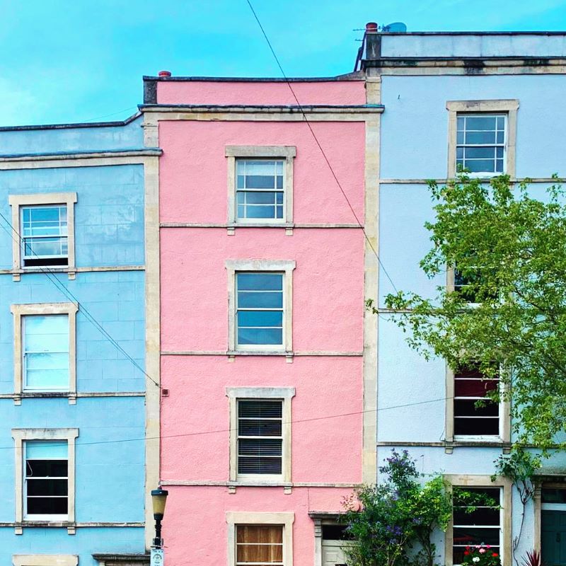
It’s no surprise that designing a new collection of textiles based on these houses was a joyful experience for me, with the biggest challenge being the limit on the number of colours I could use when working with my local mill. The final designs are intended to bring uplifting pops of colour into the homes of those who love these inspiring views as much as I do, and I’m delighted to share them with you ahead of schedule. Find out more here, and head to my online shop to check out the new collection.
Angie Parker is a weaver, designer, and colourist, based at BV Studios in Bedminster. She trained in rug weaving in the 1990s and started her textile practice in 2014. Her latest collection of handwoven designs and small-batch-produced textiles are available in her online shop. Subscribers to her newsletter are the first to see new designs and also get access to special offers and exhibition news. Sign up here to keep in the loop.
Why are some neighbourhoods more colourful than others? Is it by luck or design? And does living in a colourful neighbourhood make you happier?
My research into the history of brightly coloured houses in Bristol for my latest woven textile collection led me on a journey around the world from the comfort of my sofa, where I discovered some seriously eye-popping colour and equally colourful facts. Come and discover my new favourite places on earth, without clocking up the air miles.
How can you not have a spring in your step when you walk along these joyful Totterdown streets? Photo: Josh Perrett
For obvious reasons, I’ll start with my adopted home City of Bristol. It’s hardly a surprise that Bristol is considered by many to be the UK’s colour capital. Between the ever increasing number of colourful houses and Europe’s largest urban graffiti festival, UPFEST, the City boasts an ever changing source of colourful inspiration to resident artists and designers alike, and amazing photogenic views for residents and visitors.
The cities eclectic mix of creative homeowners is one of the reasons why the trend for painting houses in such bright contrasting colours has snowballed. I’ve managed to date one of the first coloured house back to 1966, and if you know otherwise I’d love to hear from you. This was the year that Bristol’s ex-mayor and architect George Ferguson painted his home, and it was nothing more than a way to brighten up the ugly grey render of his terrace property. Research by Architects Stride Treglown shows that residents feel a stronger sense of community and local pride in the streets where there are lots of painted houses, and while this will be based on more factors than the colour you paint your home, it certainly plays a role. There’s a lot more on the Bristol story here.
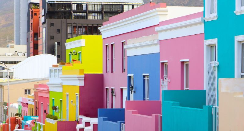
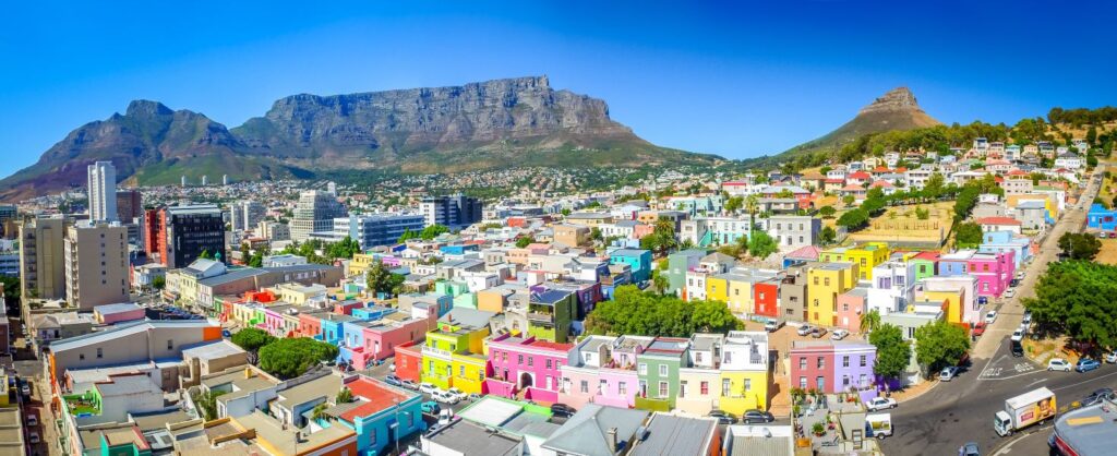
Bo-Kaap or Malay Quarter. Cape Town. South Africa. Photo: Tatyana Soares (Shutterstock)
Bo Kaap, Cape Town, South Africa is my next destination and it’s clear to see why a colour lover like me would be attracted to this neighbourhood. Formally known as the Malay Quater, the white wash houses were leased to immigrant slaves. As slavery was abolished, the houses were bought by their occupants who expressed their new freedom and happiness in the bright colours they repainted their homes. Interestingly, many of the inhabitants were craft makers, and like Bristol, we see a link between creative communities and colourful neighbourhoods.
Bo-Kaap or Malay Quarter. Cape Town. South Africa. Photo: Janice Pama (Shutterstock)
Fishing and lacemaking are the primary occupations of the residents of Burano Island near Venice, once again linking craft and colourful houses. The story here is that the fronts of the houses were painted different colours so that the fishermen could find their way home in heavy fog. I’m tempted to put it out there, that it might be more to do with finding the right house after a few too many beers at the end of the day!
Burano Island. Near Venice, Italy. 8 Photo: Olga Gavrilova (Shutterstock)
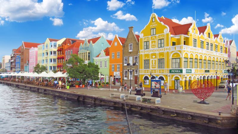
Heading over to the Caribbean, I next discovered Willemstrad in Curacao. The Dutch claimed this land in the 1630’s and under the intense sunlight, the lime-plastered buildings became a dazzling white. A former governor complained that this bright white caused him headaches and set out a mandate that the buildings could be painted any colour, except white, to ease his suffering. However, the plot thickened when it transpired that he was also a shareholder in the islands only paint shop. Fortunately, by this stage the residents had already embraced the charm of seeing the Dutch and Spanish style colonial architecture in the new brighter palette.
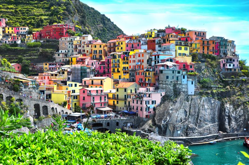
I just had to include Cinque Terre in this piece, as it must surely be one of the most picturesque groups of villages in the world. A victim of it’s own beauty, the area is now inundated with tourists and has recently taken measures to limit the number of visitors each year. I’m obviously writing this at a time when travel isn’t top of my agenda, and am thankful to the photographers who’ve shared their exquisite images of these places. The cliffs of Manarola in this photo show the pastel coloured houses which as the story goes, were painted by fishermen so they could spot their homes whilst out at sea.
Manarola. Cinque Terre. Italy. Photo: Minoli (Shutterstock)
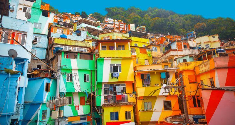
Favela. Rio de Janeiro. Brazil Photo: Skreidzeleu (Shutterstock)
In complete contrast I next remotely travelled to Rio de Janeiro. The favelas, (slums) are unlikely to be tourist magnets given their notorious reputation for crime and poverty, but artist intervention is helping to change the story using paint and colour. Dutch artists, Dre Urhahn and Jereon Koolhaas, started the Favela Painting Project in 2005 after travelling there to film hip-hop videos. They worked alongside former drug dealers to paint 34 houses and put Vila Cruzero on the map for something other than drug trafficking. Whilst crime hasn’t gone away, the transformation of the area had a positive effect on the locals. Residents and drug dealers have spoken about benefiting from the scheme which showed them that there is another way to live. It would be naive and over ambitious to suggest that artist led initiatives such as these can combat crime and poverty in this complex society, but what this does demonstrate is that art can start to bring about positive change. (A more recent example is Matthew Burrough’s Artist Support Pledge, which promotes a sustainable and equitable economy, but I digress. Any excuse to demonstrate the importance of artists and arts education in society, eh?).
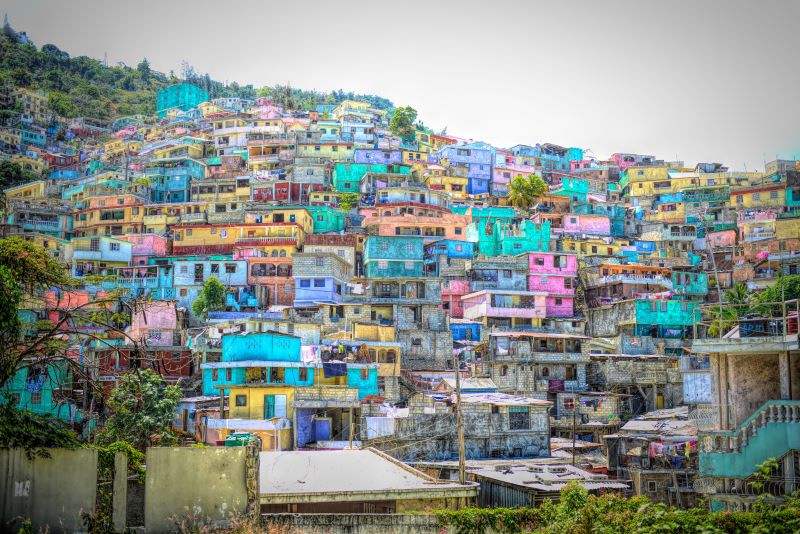
Jalousie. Port-Au-Prince. Haiti Photo: Sylie Corriveau (Shutterstock)
Another more controversial example of a slum make-over is in Port-Au-Prince in Haiti. This area was devastated in the tragic earthquake of 2010, with many residents forced to move to displacement camps. In 2013 the government rolled out a 1.4 million pound scheme to celebrate the life of Haitian artist Prefete Duffaut, and offered incentives to encourage people to relocate to the newly painted areas. The scheme has received as much criticism as praise. Whilst many of the new residents were proud of their dazzling rainbow neighbourhood, others questioned the decision to focus primarily on the mountainside which is mainly visible to the wealthy residents of Petionville. Was this as much about the views from the posh hotels as it was about helping the slums residents?
Wroclaw. Poland Photo: Pablo77 (Shutterstock)
At the other end of the financial spectrum, Wroclaw in Poland owes it’s distinctively colourful main square to the prosperous international trading times at the start of the 19th Century. The wealth of the merchants was displayed very openly in the bold colour choices of the buildings. These historical traditions have been upheld in subsequent renovations of the area.
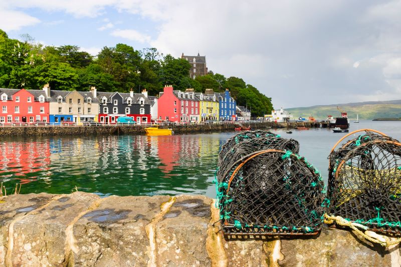
Tobermory. Isle of Mull. Scotland Photo:TT Photo
My final destination is one of Scotland’s most photographed views. (Yes, I know! All that nature and the coloured buildings take the top spot). Immortalised in the minds of pre-schoolers and parents alike, the row of coloured houses and hotels in Tobermory, will for many of us be synonymous with that ‘catchy’ theme tune for BBC’s Balamory. But this idyllic Scottish village isn’t without it’s own mini-melodrama. The Mishnish Hotel was the first to be painted (bright yellow) by its owner in 1961, and the rest of the waterfront followed suit to create the iconic view which makes Tobermory such a popular tourist destination. However, in 2006, it was painted black, as the yellow paint was high maintenance and faded quickly. Locals were disappointed but powerless to stop the move, but about 10 years ago it was restored to the bright yellow and all is well once more. (Thanks for the up to date photo in my inbox Paul).
So, what is it like to live in a neighbourhood surrounded by colour, and does it make you happier? It turns out that this is too big a question to answer here, but it’s something I want continue to explore and I would love to hear about your experiences and your favorite colourful places. And if you’re interested in seeing how these inspiring neighbourhoods inform my woven textile designs then do sign up to my newsletter in this link.
Angie Parker is a weaver, designer and colourist, based at BV Studios in Bedminster, Bristol. She trained in rug weaving in the 1990s and started her textile practice 5 years ago. Her latest collection of handwoven designs and small batch produced textiles will be launched in October 2020. Subscribers to her newsletter will be the first to see the finished designs and will access the early bird pre-order special offers. Sign up here to keep in the loop.
Have you ever wondered how creative collaborations come about?
The latest one for myself and Jonty Rose began its journey at DesignJunction in 2018 where we were both exhibiting with Design Nation.
From the start we realised that we shared a goal to create exceptional products for our adventurous client base, and we thought that together we could double the impact of our work.
What do you think?
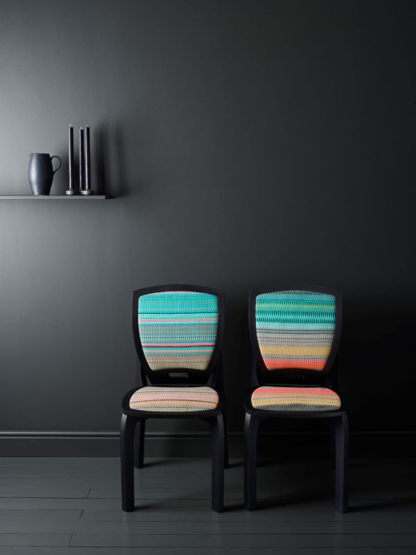
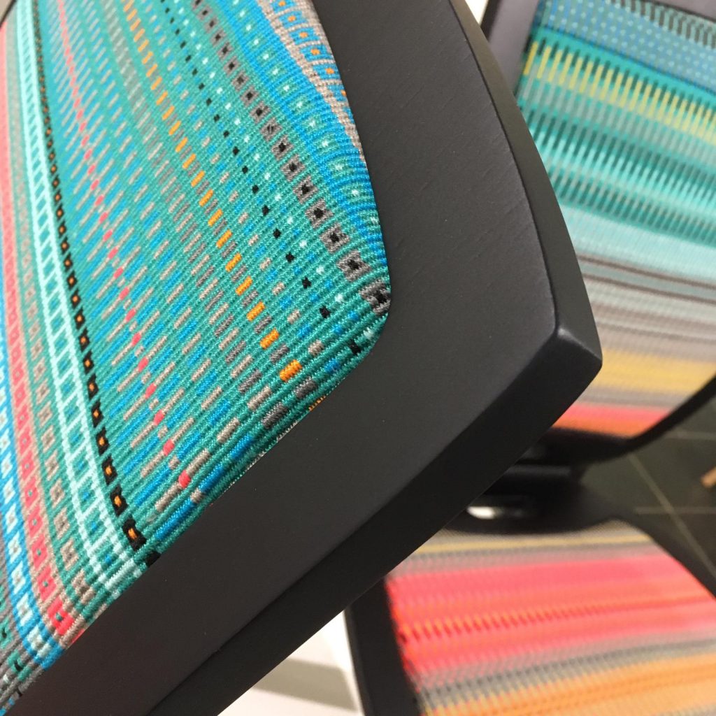
Danish Disrupted. Jonathan Rose & Angie Parker.Photo: Article Studio
We’ve been working on a project for almost a year, and we can’t wait to introduce the resulting bespoke chairs and stools at Decorex International this October.
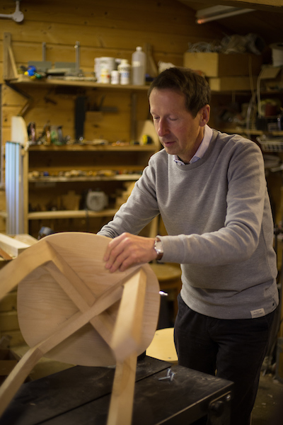
Jonathan Rose in his workshop, in Banchory, Scotland.
Angie Parker in her Bristol studio.
My statement vivid colours and exacting weaves fit perfectly into Jonathan’s danish design, in this original pair of functional artworks. They are available in further colour options and fabric designs.
Woven using my signature Krokbragd pattens, these intricate, timeless panels are time consuming to weave, and are frequently exhibited as textile art. (At the time of posting Orange Wave handwoven panel has been selected for the The Royal West of England Academy Annual Open Exhibition). Don’t expect to see too many of the originals, but browse some of my other handwoven designs here.
We both see this collaboration as an ongoing partnership alongside our individual projects and here are our thoughts on it so far.
Jonty: “One thing that is great for me is the number of people Angie knows who love quality. It has been a delight working with someone with such energy and capability (and not needing me to do any tiresome mansplaining!) I hope we can do more together.”
Angie: “Collaborating with Jonty on this project has really opened my eyes to the potential of our combined skills. Both playing to our strengths, we’ve moved pretty quickly, and have found a way to best show our strongest designs together, whilst maintaining the individual style that made us want to work together in the first place. Jonty is really easy-going, entirely professional and his expertise in managing schedules brought this project in ahead of our initial deadlines”
We’re really looking forward to chatting to visitors to Decorex International on Stand J 170, 6-9 October, or get in touch if you’d like to discuss this project using my contact page.